Art Fundamentals: Layout and Composition
Thinking visually in art, design, photography, and film
How to create a “good looking design” has some objective elements. There are shortcuts for visual appeal. Whether you’re creating infographics or taking pictures, thinking visually can reveal the secret science behind aesthetic values.
Layout is the essential framework for a piece of art or design. Neglecting structural elements makes for a confusing or unstable foundation.
Grid Systems
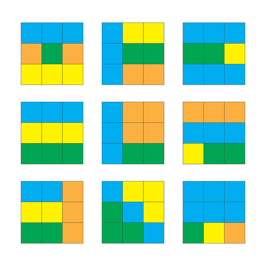
Grids can be any number of intersecting lines, between 2 and infinity. Elements of a piece should line up with other elements according to their placement in the grid. Either within the grid’s spaces or along its lines. Different sections of the grid can have more emphasis by being blocked out in different sizes.
In this example, imagine each color below is a different element. Headlines, paragraphs, bullet points, footers, etc. Like if you were designing a flyer or social media graphic.
Like in the graphic I did for BowTiedPickle’s hackathon:
Every element falls into distinct sections.
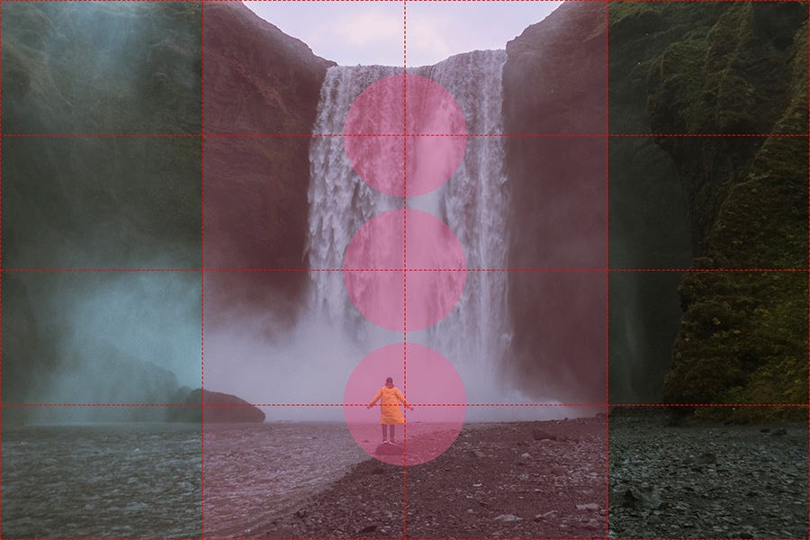
Grid systems are also used in photography and film.
In this example, details are focused into the middle section, especially in areas where the grid intersects.
Which brings us to:
The Rule of Thirds
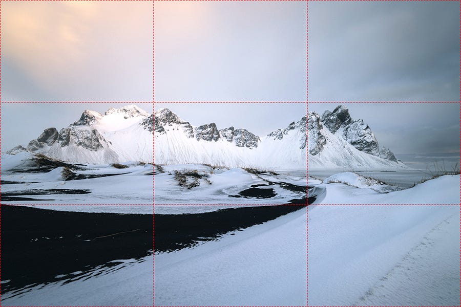
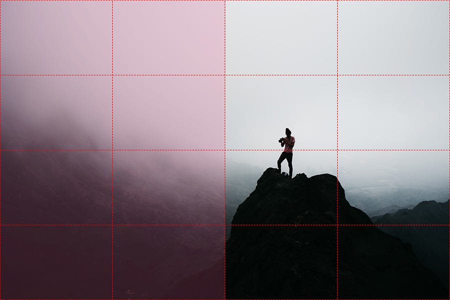
This is a subset of grid systems, emphasizing “thirds” instead of any number of pieces. It’s most common in photography and filmography.
Again, all major details are in the middle section, but horizontal this time instead of vertical.
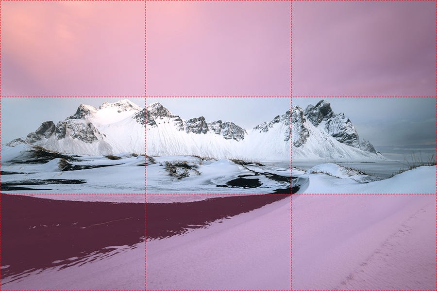
The surrounding sections help to emphasize the focus. Sometimes art partly relys on what’s NOT expressed. Combine what you say and what you don’t say.
Also see: clear space, blank space.
Here’s one with even more “nothingness” to bring the viewer’s eye to the main subject.
Same as before - the top and bottom are “extra” and the focus is on the middle section.
However, there’s another layer on top of that. The photo uses halves vertically, as well as thirds in the horizontal.
You can combine grid systems in many interesting ways.
The Golden Ratio (Fibonacci Sequence)
This is a grid system in its own way. Many natural elements fall along this or close to it. Spiral galaxies, phyllotaxis, nautilus shells, etc.
Also see: the Golden spiral.
Balance (Symmetry vs Asymmetry)
“Balance” is using elements evenly or unevenly. This can be symmetrical (perfect balance, formal appearance, mirroring elements) or asymmetrical (imperfect balance, similar yet non-identical elements).
Mirroring is standard in things like classically-inspired architecture and metal logos.
Proportion and scale are related terms. They both refer to the relationship between elements and a piece as a whole.
Proportion is one part of a thing versus other parts of a thing. Often used for sculpture and statues - like whether the head is too big for the body, or if it has the perfect visual size.
Scale is more for a thing versus another thing. Like if a painting shows one person much larger than other people (either from perspective or Hieratic Scale).
As an example, something can be proportionate and asymmetrical.
Visual Hierarchy
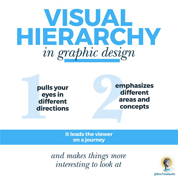
I touched on this in a recent thread. Ways to separate elements and create emphasis include size, color, location, typography, and open space. You can even add literal dividers or highlights. This is also a method of grouping related elements.

Patterns & Rhythm
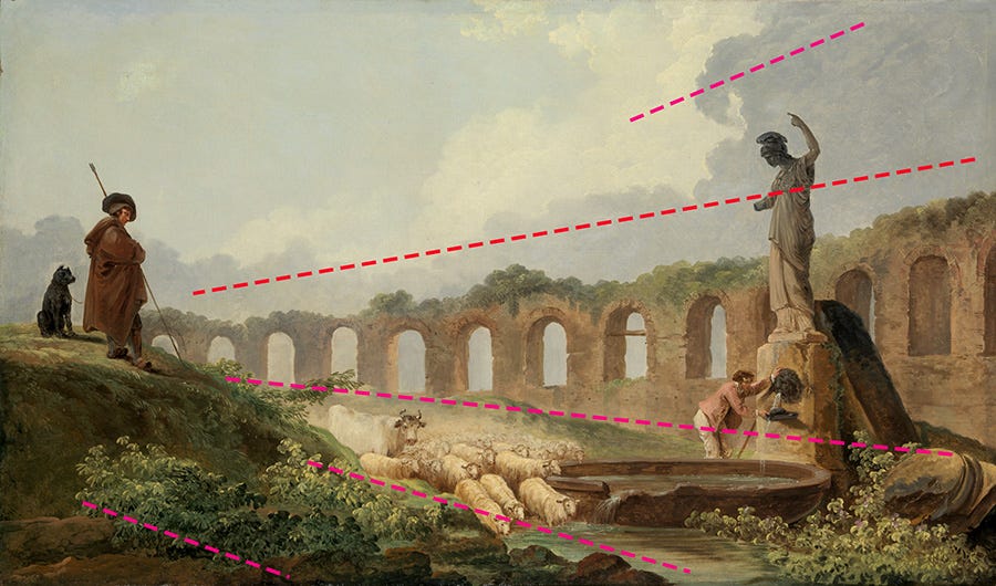
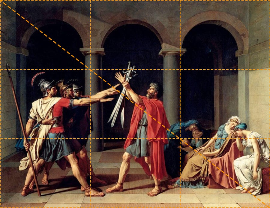
This is a subset of Visual Hierarchy. By emphasizing certain areas of a piece, you create “movement.” Depending on where and how the viewer’s eye travels down a path, you can get a dynamic feeling. Especially when diagonals are used.
You can set a visual “rhythm” depending on how elements are placed. If the movement is regular, you’re setting a specific pace for the viewer. Repeating elements, whether structured (patterns) or less structured (repetition) may influence this.
Variety & Unity
Variety showcases visual differences, while unity showcases similarities. You can however combine these. A triptych, for example, is three distinct paintings united by a common theme and style.
In graphic design, branding is a perfect example. Everything created under a singular brand should relate to that brand (via unity) even in different applications (variety). Like social media graphics versus a polo-shirt uniform. You can tell they’re from the same brand even though appearance is dissimilar.
Social Expectations and Existing Conventions
In the internet age, users now expect certain things from websites. If you’re a UI/UX designer, you have to understand what users are familiar with. People don’t like changes, especially drastic ones.
The top section of a website, for example, includes a company logo and navigation menu. If you put a menu in the footer, no one will use it. A hero image commonly follows or is integrated with this.
Accessibility
Layouts have to account for the fact that perceptions differ. Color-blindness is relatively common, as are near-sighted and far-sighted people. Elements of design can consider these people with only minor changes. Each element should be easy to distinguish from other elements. No clashing colors, overly monochromatic style choices, etc. Emphasize contrast and legibility.
Good design streamlines user experience. It’s efficient and doesn’t complicate things.
Conclusion
By using all of the above, you’ll find infinite ways to structure every idea.
You could have asymmetrical balance, using thirds for a grid system in a steady rhythm, having low variety. Or a symmetrical piece based on the Golden Mean that has wave-like movement and high variety.
Endless possibilities before we even get to the content itself.
Next week, we’ll discuss more about photography:
This is a reader-supported publication. For further support of my work:
I sell physical artwork at ApolloGallery.org with more to come
You can hire me for graphic design work


