Debranding: No Visual Fun Allowed
Company logos are becoming generic and sterile - here's why and how
Twitter recently led to discussions on differences between modern graphic design and its older forms. There IS some natural ebb and flow. Things come in and out of fashion. Currently, we have two seemingly contradictory styles: nostalgia-based, and minimalist “de-branding.”
The history of graphic design is surprisingly expansive. It spans thousands of years, so we’ll leave that for another time. Let’s start with a brief look at the 1900s.
Before computers, everything was done by hand. Pencils, protractors, scissors, the works. If you’ve watched “Mad Men” then you’ll have an idea.
When computers came onto the scene, designers suddenly had a massive toolbox. And they wanted to use that entire toolbox. Logos became more futuristic and convoluted. Gradients, shadows, shine effects, 3D rendering, cartoon characters, etc. Many designers abandoned the “less is more” strategy. In some cases, it worked.
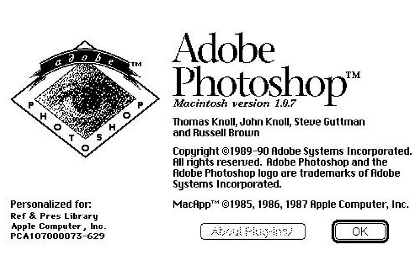
Photoshop 1.0 was released in 1990. This arguably had the biggest impact on graphic design since the printing press.
The next revolution is coming from mobile devices. They’re small. Everyone has them. And now people are using their phones as a proxy for stores. Buying clothes, ordering food, hailing a cab, etc. In 2022, companies refusing to consider mobile strategies are risking collapse.
Branding is following along here. Making logos visible on small screens requires simplification. It’s something companies were already considering, anyway. After the exuberance of the 90s, marketing departments were trying to pare down over-designed logos in the name of corporate professionalism. This led to the “flat” design push.
You’ve probably seen this “faceless corporate” style of illustration, especially among tech companies:
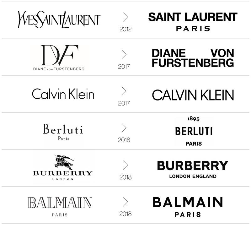
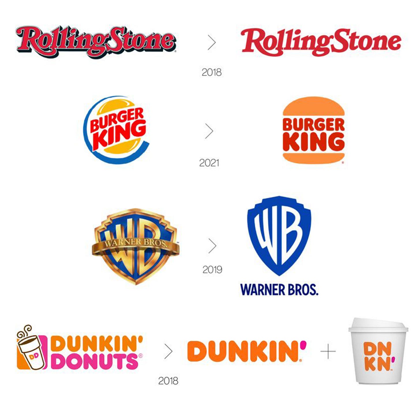
Unfortunately, brands are taking this too far. In the simplification process, they’re stripping away any personality and relatability from their branding. Logos are becoming boring and sterile. Over-polished until nothing remains. We refer to this as “de-branding.” Companies are whittling down appearance to de-emphasize their brand.
Fashion companies are especially horrible at this:
Disclaimer for hair-splitters: Yes, technically, there are different types of debranding. No one cares since the differences in definition are small.
Some corporations try to make up the shortfall by emphasizing other aspects. After all, branding isn’t just about logos. It’s colors, photography, illustrations, copywriting, messaging, layouts, and other stylistic choices. Web/app design and social media communication is the new emphasis.
Marketing departments argue that simpler logos are more flexible. More variations, for instance. And customers may have subjective interpretations, which could make them feel “closer” to the brand by assigning their own meaning to it. They also claim that stripped-down logos are somehow less corporate. Most excuses are just excuses. Anything can be justified in retrospect if you try hard enough.
There’s a lot of crazy nonsense in design to justify the price tags of rebranding. Pepsi has the most spectacular failures here.
In 2008, Arnell Group received (stole) $1 million from Pepsi for an insane rebranding effort. The full PDF is here and it’s an entertaining read. Highlights:
“The investment in our DNA leads to breakthrough innovation and allows us to move out of the traditional linear system and into the future.”
“The vocabulary of truth and simplicity is a reoccurring phenomena in [Pepsi’s] history.”
“The Pepsi Ratio is aesthetic geometry.”
“Gravitational Pull of Pepsi”
“The Pepsi Universe”
Then, Arnell Group did it again. Tropicana (also owned by Pepsi) launched a rebrand in 2009. They spent over $30 million on the packaging and a new advertising campaign to promote it. Things didn’t go as planned. Sales dropped by 20%, consumers trashed the brand on social media, competitors scooped up market share, and Tropicana lost millions in revenue. After just two months, they reverted to the previous design, and threw out the rebrand.
So we can see that even billion-dollar corporations have no idea what they’re doing. There isn’t any reason to let them lead the charge on branding. “Return to tradition” is a meme these days, but it’s also evergreen advice in cases like this.
Some brands are trying to buck the trend. They’re a minority though.
Brands are losing their visual luster. No uniqueness. No cultural impact. It’s like major cities demolishing older buildings to generate more cookie-cutter glass-and-steel skyscrapers. It all blends together into a generic globalist soup.
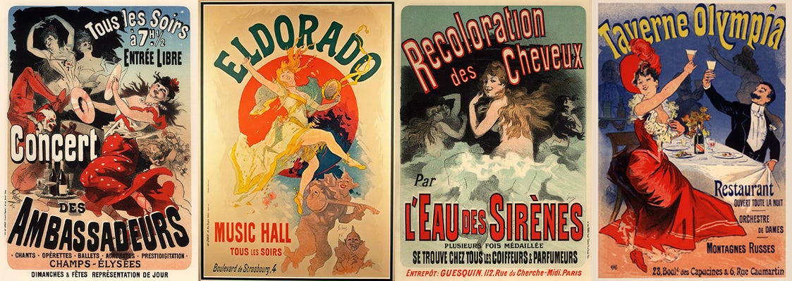
It’s a slow march toward nothingness. And it isn’t new, either. For example, compare modern advertisements to anything created before computerized design. Like these Art Nouveau posters by Jules Cheret, made between 1894 and 1902:
They’re lively and colorful. A little busy at times, but fun. Natural. Human. An actual person worked these designs, with their hands, instead of a 500-person marketing department trying to justify salary expectations.
Tradition and historical precedent exist for a reason, and we shouldn’t ignore or discard them.
Aesthetics matter.
This is a reader-supported publication. For further support of my work:
I sell physical artwork at ApolloGallery.org with more to come
You can hire me for graphic design work


