


Typography 101: The Aesthetics of Text
An Introduction To Fonts And Typefaces

Typography is the art of words and letters, along with their related numbers and symbols. The clarity and/or aesthetics for it all. This involves fonts, typefaces, type families and styles, case, contrast, etc. It pairs with color psychology and other imagery to display the meaning driving your messages.
One author compared it to sculpture–it isn’t just the shape, but material and space around the construct too. Typography is the art of arranging letters, words, and lines, as well as their size and shape, to communicate ideas while emphasizing legibility and readability. Unless you have a brand where that isn’t the aim, and words are more decorative than anything else. But you have to know the rules before you can break them.
These days, non-industry people use “font” and “typeface” interchangeably. In most cases, people are discussing typefaces–the collective letters and glyphs of a unified design. “Font” refers to the variants (size, weight and style) of a specific typeface. Eg, “Times New Roman” is a typeface while “Times New Roman MT Bold Italic” is a font.
Don’t sweat it if you mix these up. In the modern age, no one really cares except type designers and the biggest nerds. It’s just semantics, and we all know what you mean.
A Brief History of Typography
There’s an argument to be made that typography began when writing systems first emerged. The earliest developed between 5000 and 3000 BC. Clay tablets, wood engravings, seals, etc.
Most famous are cuneiform and hieroglyphics. The question is whether aesthetics factored into their invention, or if they were purely utilitarian. I think we can assume the former. Especially with the Egyptians.
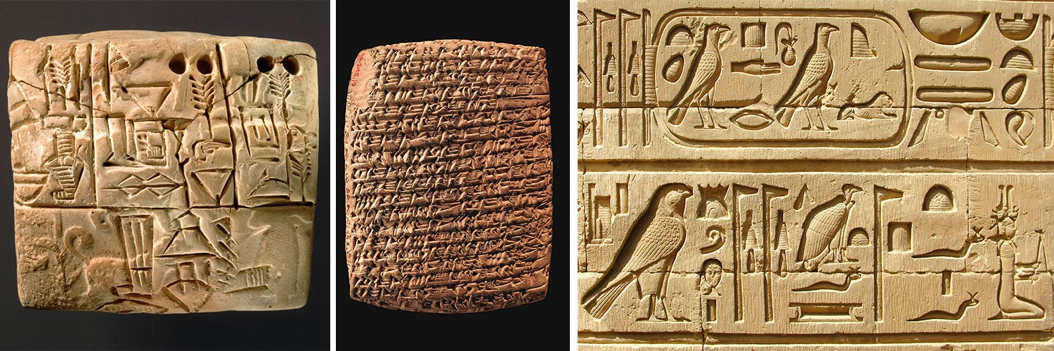
The first true alphabet is likely the Phoenician alphabet (Early Linear Script) invented shortly before the 1200 BC Bronze Age Collapse. Written Chinese developed around the same time, and calligraphy became popular as solid standards emerged, especially after 220 BC.
Side note: calligraphy is handwritten, usually in ink, with an emphasis on aesthetics and irregular appearance for each character. Typography is a more formal and standardized system, even if some types of calligraphy are standardized in their own way.
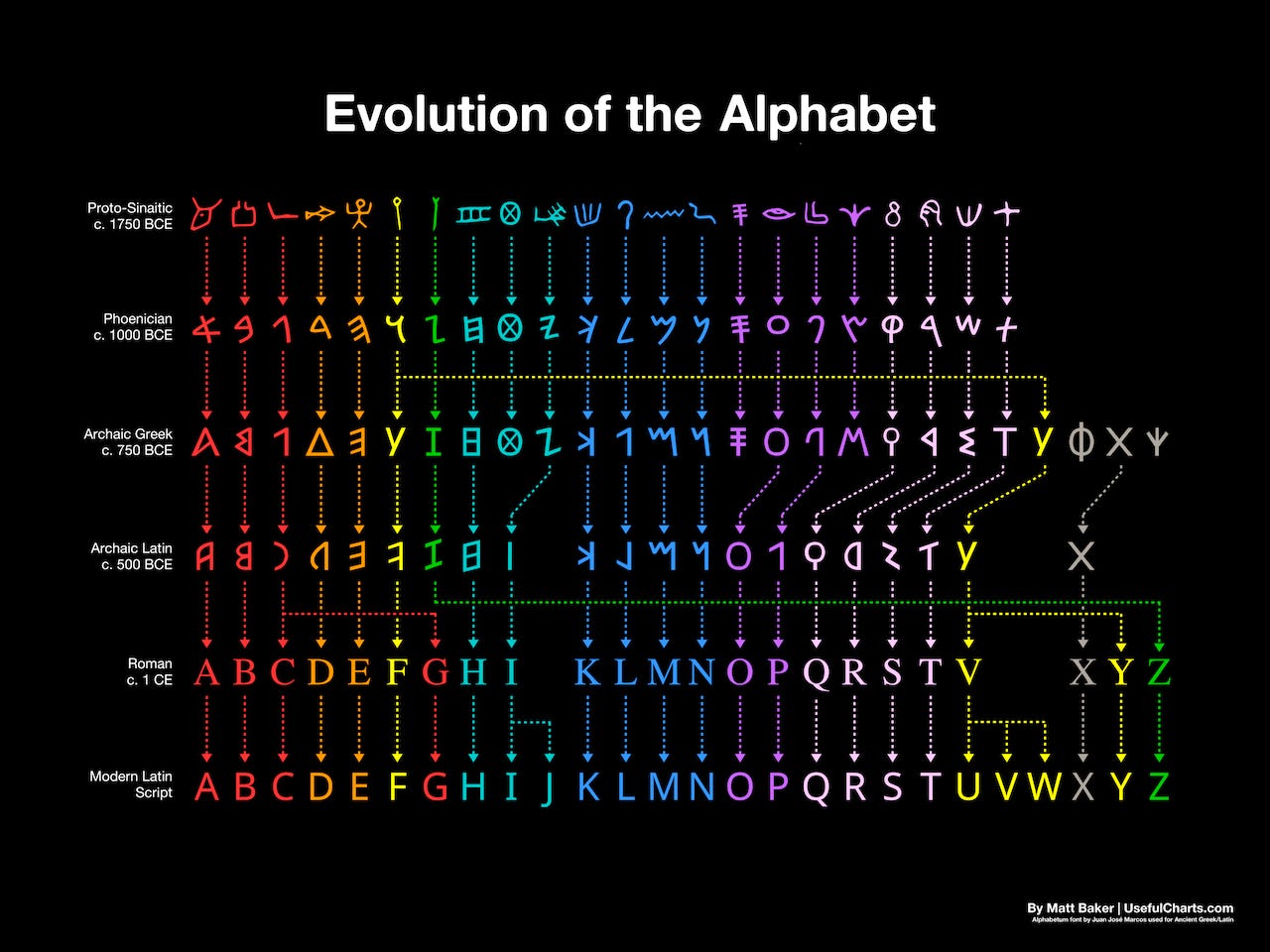
The Western Latin alphabet developed in ancient Rome. As the Roman Empire came into being and soon conquered a vast swath of the Earth, many cultures adopted or integrated this alphabet. It persisted even after the empire’s collapse, in part because of multiple Greco-Roman revival movements and the Christian Church.
You may have seen this chart floating around the internet:
“Modern” typography began with the printing press and lead-based movable type, as invented by Johannes Gutenberg around 1440 AD. Gutenberg wasn’t the first to invent movable type (the Chinese for example had it over 400 years prior) but he was the first to arguably “perfect” the craft. His way of casting type in lead was easier and more durable than previous systems. Gutenberg even fired out innovations in ink and paper.
A “printing revolution” followed. It created a feedback loop: more books led to increased literacy, which increased the demand for books. Europe is thought to have printed 20 million books in the first 100 years of the press, and over 150 million in the following century.
The written word received vast and unprecedented attention. Typography evolved alongside printing presses and other inventions. The first big change was moving from Blackletter to Roman styles to increase legibility.
Things see-sawed and yo-yo’d from there. Designers threw every idea they had at the wall. Many stuck. Those that did were refined to reach their full potential.
By the 1980s, designers had software to create digital typefaces. And that’s where we still are, more or less. Typography is a pretty traditional art because typefaces are already well-optimized. There isn’t much room for true innovation in the field. Even new fonts are generally slight modifications of older designs.
Now let’s turn up the autism. Wtf makes a typeface, really?
Classifications
Typefaces fall into 5 main categories:
Serif (has pointy or bulbous ends on letters - or for Slab Serif, blocky ends on letters)
Sans-Serif (no ends on letters)
Blackletter (Medieval style)
Script (calligraphy-inspired style)
Display (generally more decorative than functional, may not be legible, and not intended for use in things like emails or essays)
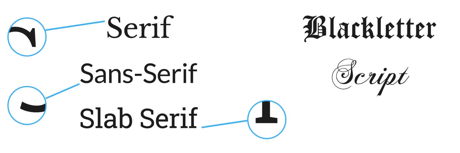
Serifs are the most formal, with slab serifs as slightly more casual and modern.
Sans-serifs are the most modern and least formal.
There are MANY more specifics here (such as subcategories) but for now, time to move on. We don’t need a 10,000 word email going out.
Other style considerations include weight and whether the typeface is monospaced or proportional. Weight is how thicc your letters are, as shown below:
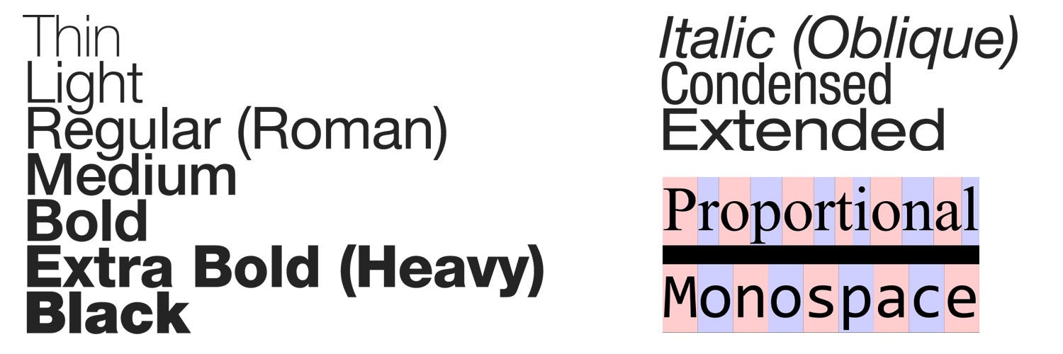
Proportional typefaces vary how much space goes around each glyph. Something thin like an “i” will have less space than an “o,” for example. Monospaced type has the same space no matter what.
Letterform Anatomy
Each part of a letter has its own name and design rules.
For brevity, here’s a guide from Vis.me (you may have to zoom in)
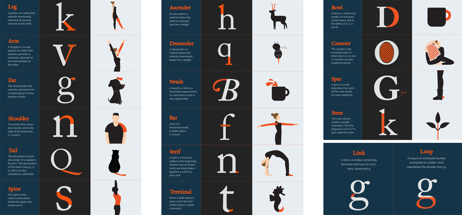
Or check Wikipedia: https://en.wikipedia.org/wiki/Typeface_anatomy
Most people don’t have to consider this information. Even entrepeneurs don’t need to know the difference between an ascender and cross bar. What’s more important is the next section:
Leading and Kerning
Kerning (“tracking”) is the space between letters. Some typefaces will automatically adjust, to an extent, while others need manual adjusting for optimal aesthetics. (Remember: proportional vs monospace)
Kerning practice: https://type.method.ac/

Leading is the space between lines.
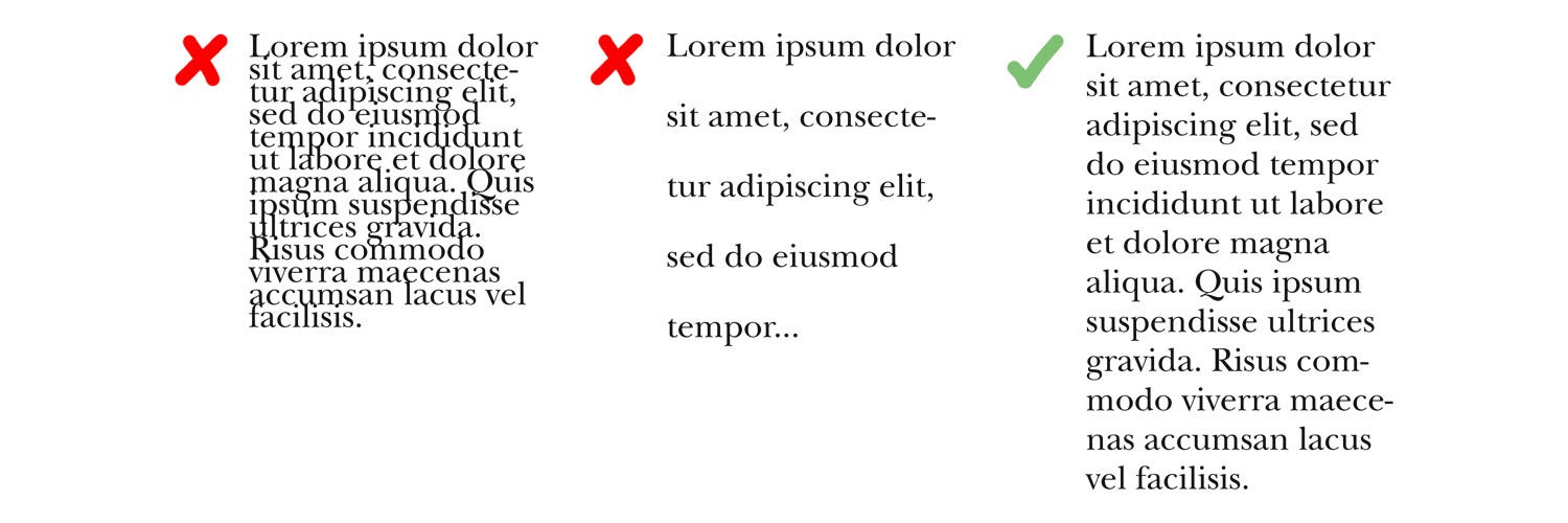
Side note: avoid “orphans.”
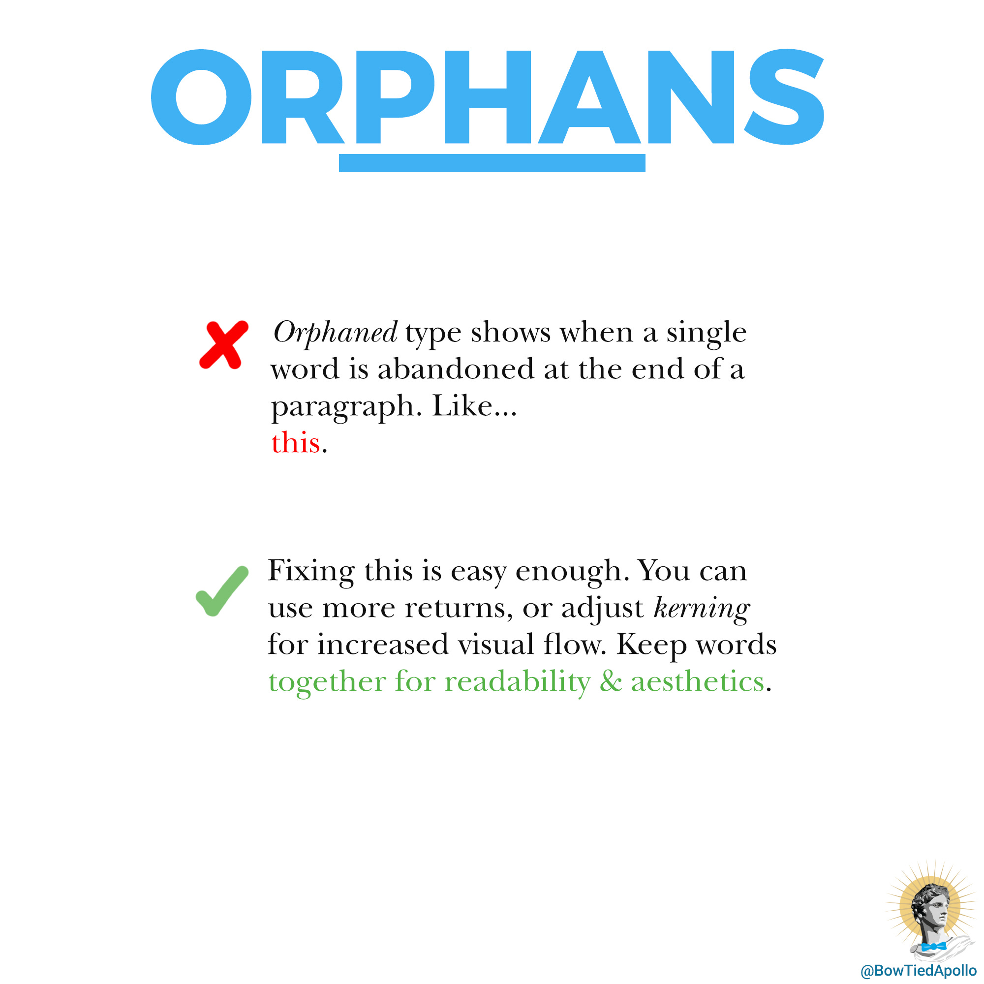
I did a short thread about this a while back.
Conclusion: Application and Branding
Pulling this all together: typography is the aesthetics of words, with a long history, and falls into a few major categories. Which category you use depends on your goals. If you’re writing an essay, go for a serif. If you’re banging out an email, sans-serif all the way. Etc. Then if you’re making your own stuff: notice the kerning, leading, and orphans.
And don’t forget other design principles like visual heirarchy, color palettes, and contrast.
Fonts are a massive topic with countless books written about them. Stranger-than-fiction news, such as a story about a man who spent four years recreating a typeface lost in a bitter rivalry. Small details, like choosing OpenType versus TrueType. (Open is more flexible, as one might expect from the name.)
But as with all things, we have the 80/20 rule: 80% of what you need to know is in this brief introduction to typography. I try to keep things efficient. For entrepeneurs and start-ups, typography doesn’t have a huge impact beyond the basics. It's mostly just serif vs sans-serif depending on how your brand should appear to the world. You can find many free fonts at Google Fonts.
Brands use a number of differentiating factors. Though for more about branding, I already have an article written.
Overall: typography is an integral part of messaging, both subliminal and explicit. What will you do to help bring that messaging to life?
This is a reader-supported publication. For further support of my work:
I sell physical artwork at ApolloGallery.org with more to come
You can hire me for graphic design work
Great overview of a subject I’ve never read beyond the surface level! A lot of programmers use custom typography since we stare at it all day and want to make it look good. That’s also a rabbit hole since you need to figure out if you want monospaced or non monospaced, ligatures or not (think combo symbols like <= turning into ≤ automatically), and much more. I really like Fira Code as a font for viewing all day but there are plenty of options.