


What Makes A “Brand”? Everything You Need To Know
How to develop personal branding and corporate identities

A brand, whether personal or corporate, contains the same elements: cohesive visual system and messaging. A set of values and aspirations. It’s the unifying elements that surround you or your business, defining your reputation and identity.
What a brand *is* has expanded over the years. More flexibility, more comprehensive; both complex and simple. At its core, it’s a way to quickly and distinctly communicate what you’re all about. Most people associate branding with logos and other imagery. It’s more like a persona; there are physical and emotional elements at play.
If you don’t define your brand properly, others will, and that’s an unnecessary risk. Public perceptions will shape how (or if) anyone does business with you. A bad brand, with negative emotional triggers, is a death sentence. You have to throw it out and start over with a new name.
Corporations compile everything into a Brand Guide. Personal brands may wish to do this too. It becomes a handy reference, especially as you scale, and maintains consistency. VAs or employees can easily see what you’re trying to do and how/why.
A traditional brand (identity) guide only shows visuals:
What the logo is (including its variations)
How to logo can and can’t be used (inc clear space)
Color choices
Typography choices
Stylistic choices for content creation and communication
That’s it for basics. Maybe some examples (like t-shirt mockups) and dos/don’ts in stock photography. More comprehensive guidelines could have multiple identity guides, copy guidelines, patent information, email signature formatting, etc.
It depends how specific you want to be. Guidelines can be one page or dozens of pages. I know one company which lists how phones should be answered and what voicemails should say.
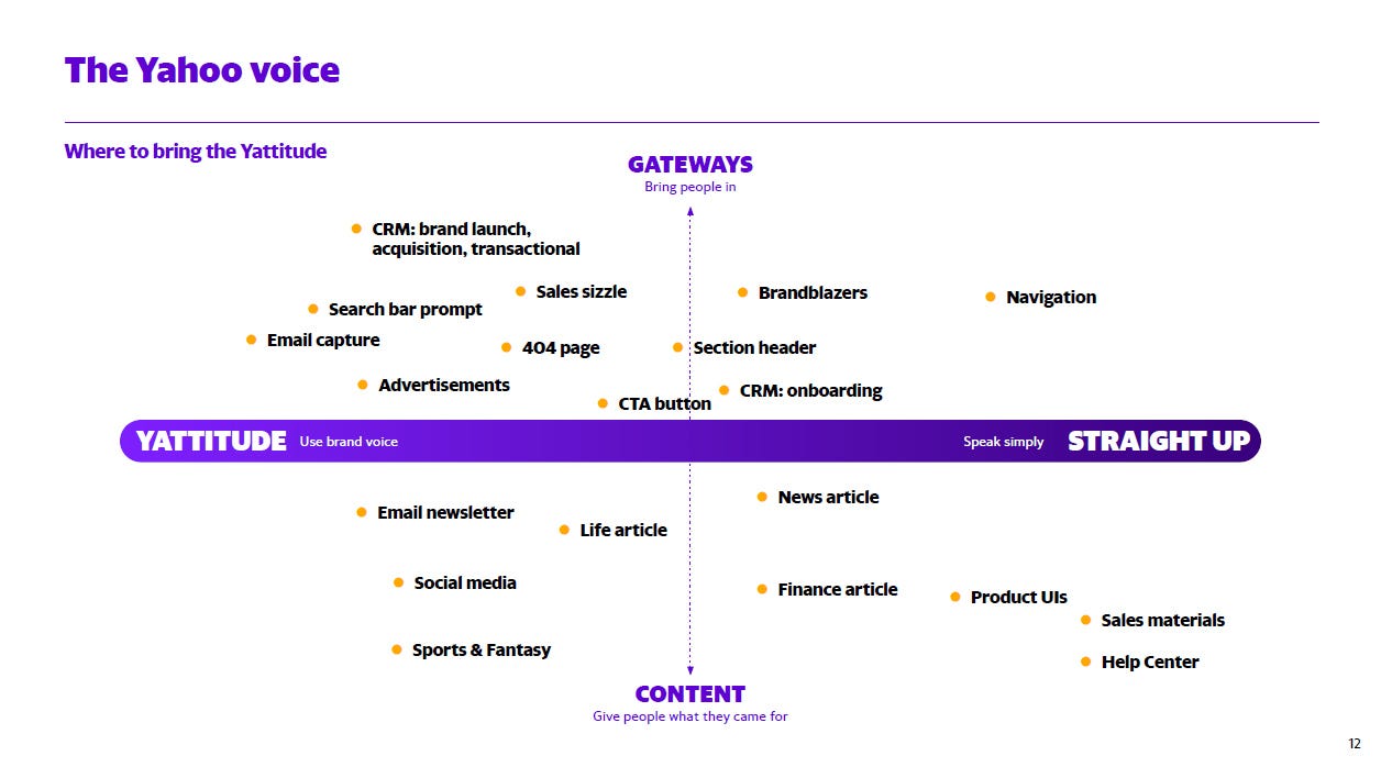
Yahoo is an example of being unusually specific with tone and style. Here’s one of the 108 pages in their brand guide:
Logos have been de-emphasized in recent years (also see: debranding) yet remain important. It’s a visual identifier for your brand. It instantly communicates what you’re about, to an extent.
Logos and profile pictures are generally designed in accordance with consumer expectations for a business. Different companies do different things. You wouldn’t expect a fashion house to look like a construction company, or a pet food supplier to have a logo in the style of a big bank. This would confuse people.
Stylistically, logos fall into certain “genres.” This includes wordmarks, letterforms, heraldic, abstract, and more. I’ll cover this in a future article.
There may be different designs for one logo: vertical formats, horizontal formats, dark backgrounds, light backgrounds, small formats, large formats, etc. For example, a logo may be simplified for mobile devices or websites, compared with posters and billboards.
Typography has its own expectations.
Sans-serif = relatable and modern
Serif = traditional and upscale
Etc.


Color psychology has more subconscious associations.
Red = passion, energy
Green = nature, money
Blue = trust, wisdom
Yellow = low-budget, cheerful
Black = luxury, serious
Etc.
Silicon Valley is a big fan of blue (Facebook/Meta, Twitter, etc.)
More about color psychology:

Dos and don’t on color usually reference contrast and/or clashing combinations.

Messaging falls in line with color. Is your brand friendly and optimistic? Serious and straightforward? Snobbish? Bold and controversial? Etc. These work together to create a believable experience for customers.
It’d be confusing to people if your logo was friendly, colors were bold and aggressive, and messaging/tone was monotonously matter-of-fact. “I don’t understand what’s going on here, I’ll leave and check out someone else instead.” Even if they can’t articulate why, people can sense mismatches and fakery.
After the visual/communication aspects, it gets more nebulous. Some companies even have specific sounds, like Electronic Arts or THX.
All B2B/B2C needs to stand out among a sea of competitors, and branding is where the magic happens. This is especially true after dropshipping took off. When over a dozen people are selling the exact same product, how do they set themselves apart? Branding and positioning are the most obvious.
Many companies have a set of values and goals for employees to emphasize. ESG and “sustainability” is the current trend.
Branding guidelines in the wild
Let’s take a quick look at examples of how various entities approach branding.
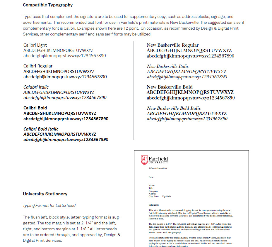
Fairfield University’s brand guide says:
“Fairfield University’s ability to carry out its mission can be helped or hindered by the perceptions of the people it seeks to serve. Its visual image – the appearance of the University’s brochures, advertisements, and other materials – says something about its values, purpose, and services. A cohesive graphic style conveys a sense of identity and personality, which helps to create greater recognition and understanding. In addition to its image-enhancing value, a carefully managed visual identity program actually saves time and money. By applying these simple guidelines, stylistic decisions may be made quickly, efficiently, and cost-effectively. Consistent application of the standards outlined in this manual will help enhance Fairfield University’s visibility, image, and reputation.”
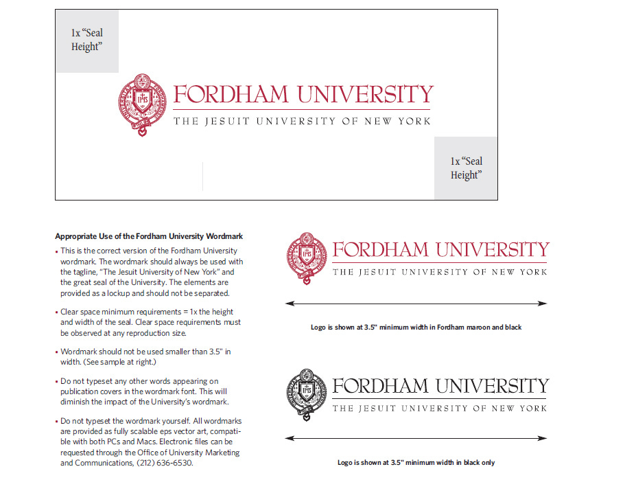
Fordham University’s guide states:
“Necessary to our advancement is the clear and direct association of all of the University’s schools, departments, programs, centers and institutes with each other and with the symbols that have been the graphic expression of the heritage, values and traditions of the University for 165 years.”
However, neither guide clearly says what those values and ambitions actually ARE.
You can see in the visuals that both Fordham and Fairfield have upscale tradition-oriented branding (serif fonts and heraldic/shield type icons). The red and black colors convey confidence, strength, and a passion for their mission(s).
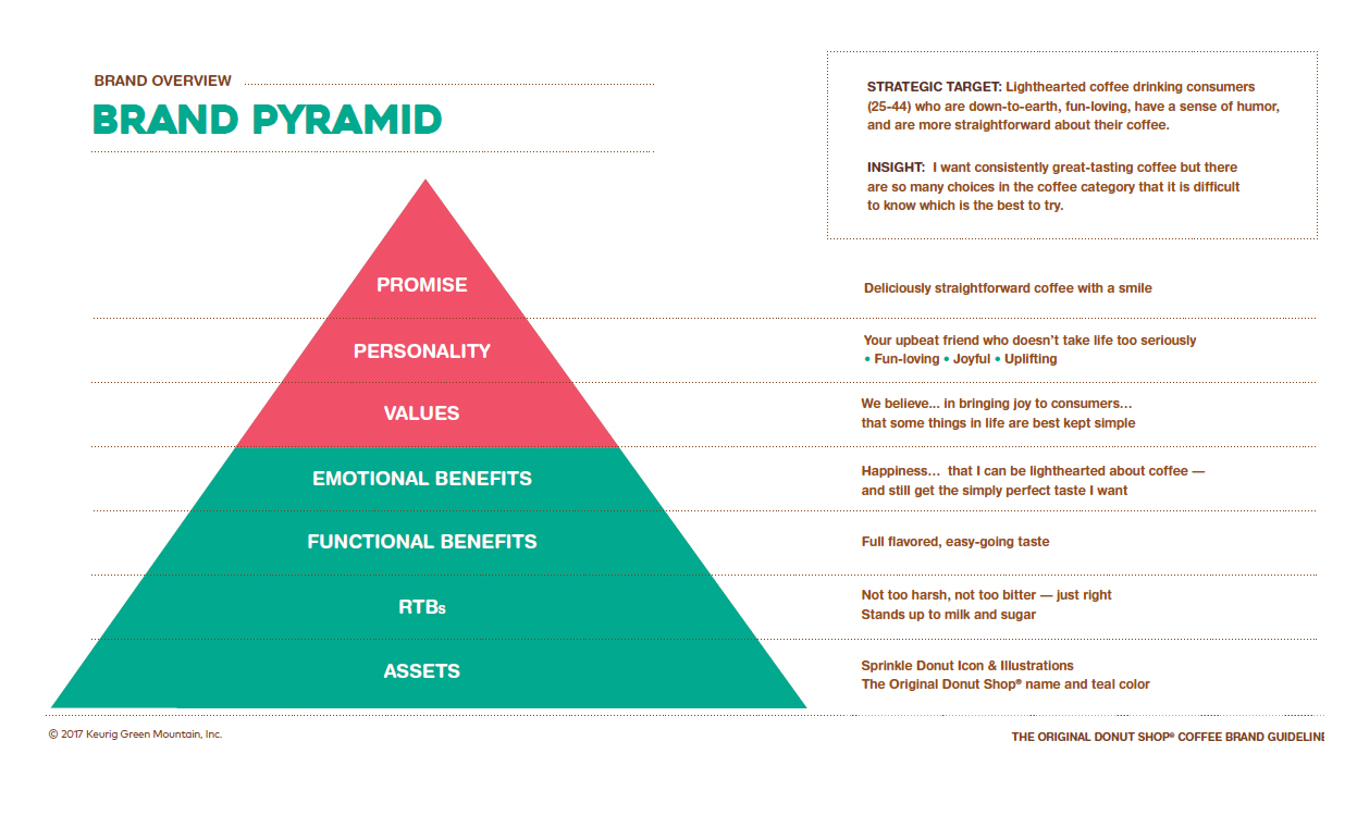
The brand guide for Keurig Donut Shop Coffee begins with:
“We are playfully irreverent providers of simply delicious coffee. From our vibrant packaging (and delightfully decadent logo) to our cheerfully uncomplicated coffee, we take pride in producing straightforward, full-flavored coffee that isn’t afraid to sprinkle a bit of fun into daily life. Because we believe great coffee is best served – and best enjoyed – with a smile.”
This is a viewpoint which affects all aspects of the brand: customer service communications, color psychology, etc. Their keywords are: Fun, Playful, Friendly, Straightforward, Uncomplicated, Outgoing, Lighthearted. They even list antonyms.
Keurig carefully showcases their target demographic and how they like their coffee, along with other insights. If you want to see a comprehensive and effective brand guide, this is a must-read. You may be able to find a PDF online.
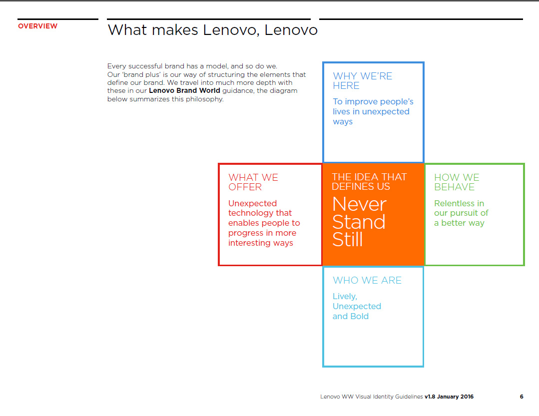
Lenovo’s key words and phrases:
Moving forward
Progressive
Always seeking a better way
Dynamic
Digital-first
Attitude
Energy
Vibrant
Enthusiasm
Bold
Relentless
Now, whether Lenovo successfully communicates this to its audience is a different story. I’ve never heard anyone say “wow I love Lenovo, they’re so fun!” But their brand guide does attempt to reflect their goals (as best as a massive corporation can, anyway).
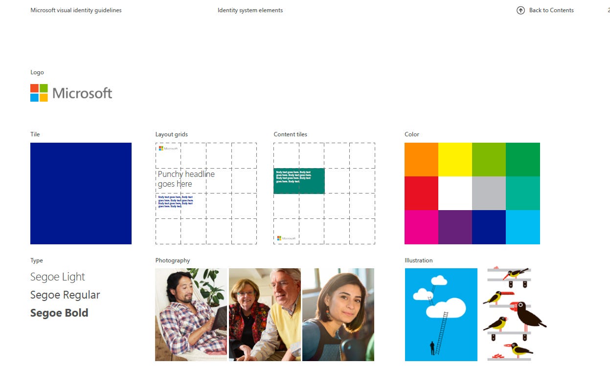
Microsoft is another one which stumbles. Their 2013 brand guide says “The new Microsoft logo is familiar and welcoming, drawing upon the heritage of our brand values, typeface, and colors. The symbol is built for the digital world, supporting the diversity of our businesses, representing and endorsing our products and services.”
A group of squares coupled with a sans-serif font isn’t particularly “welcoming.” The guide does have interesting information (grid system, color palettes, etc) but like many other brands doesn’t explicitly address brand values. They get close in “what we want people to think” except it’s generic corporate talk and the last line is “it feels like Microsoft” which is meaningless. “What do you think about Microsoft?” “It’s Microsoft!” K.
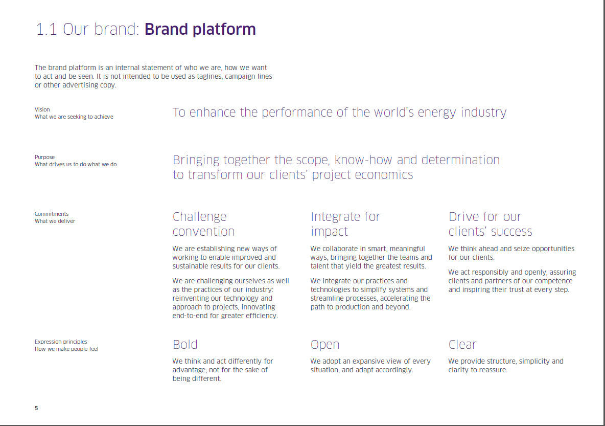
For a final example, let’s look at TechnipFMC. This is another comprehensive guide, although slightly less than Keurig’s. They list their vision, purpose, commitments, and methods of expression.
Personal brands can be more expressive and flexible than corporate brands. Both still share many of the same elements.
It’s not set in stone either way. Rebranding (or a refresh) is a necessity every 5-10 years to keep up with the times. New technologies, new consumer sentiments, etc. Don’t be that credit union who hasn’t updated their website since 1993. It’s not just job security for designers like myself. There are always potential improvements.
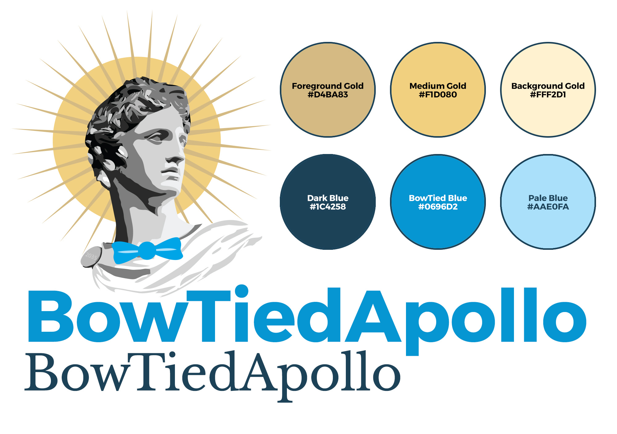
What is the Apollo brand?
Admittedly, I’ve been somewhat inconsistent so far. Picking semi-random fonts, changing colors, etc. Still deciding which paths to take. But the core always remains the same:
Vision: To create a world which emphasizes beauty and strength (as opposed to contemporary society’s priorities) to uplift humanity. This can be accomplished through initiatives like proper humanities education and art appreciation drives.
Messaging and tone: Straightforward, honest, curious, optimistic, semi-professional
Colors: Gold (optimism, luxury, sun) and Blue (trust, bowtied, etc.)
Typography: Both serif (traditional, upscale) and sans-serif (modern) as a microcosm of my blend of both traditional beliefs and usage of contemporary technologies (such as cryptocurrency, NFTs, and WiFi money)
If I was to make a branding guide for myself, it’d start with these elements.
Maybe I’ll go over more in a future article. One doesn’t need to be a designer to appreciate design. Everything is branding, much like how everything is sales.
This is a reader-supported publication. For further support of my work:
I sell physical artwork at ApolloGallery.org with more to come
You can hire me for graphic design work
So much value here. Ty