
Typography 102: Font Pairings and Other Applications
Using Principles of Typography In Design

Now that we’ve briefly discussed the basics of typography, let’s dig into use cases. Knowing the history and vocabulary only gets you so far in creating better graphics.
Font Psychology
Different typefaces carry certain connotations. As previously mentioned, sans-serif is more modern, serifs are more traditional, and variations can be somewhat in-between.
Some examples:
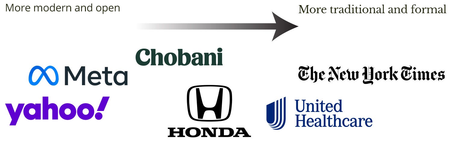
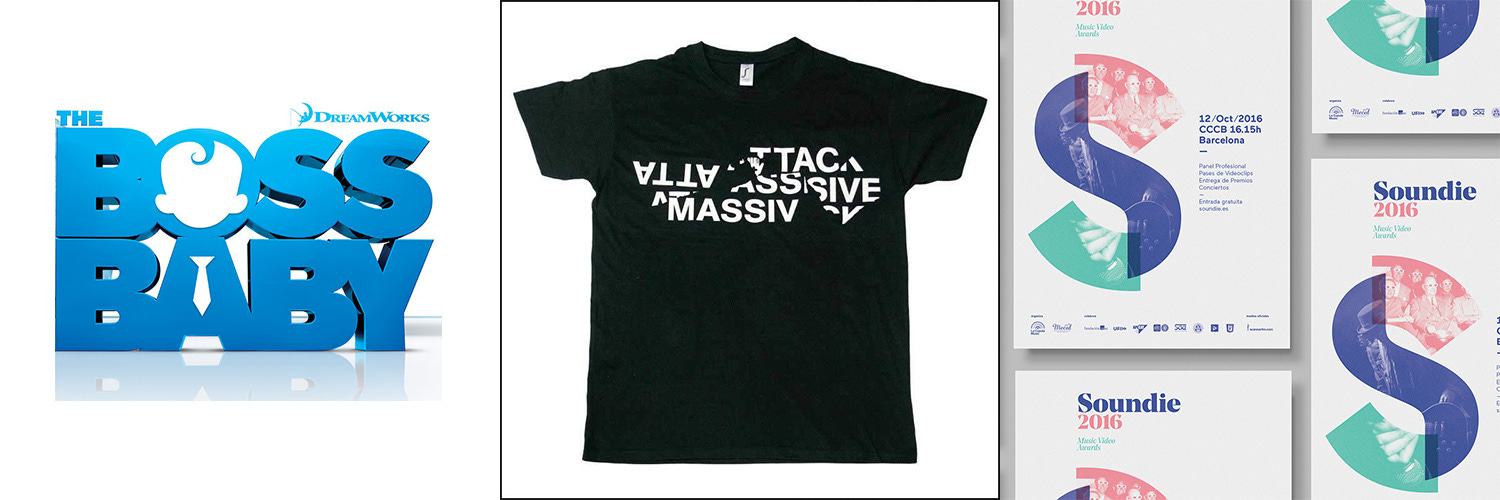
Tech companies like Meta/Facebook often use sans-serif typefaces with blue colors. This emphasizes “trust,” as ironic as it might be.
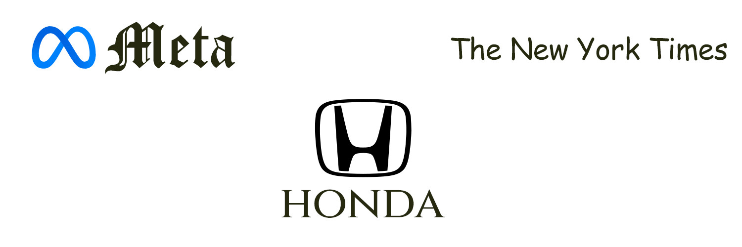
If we mix up the typefaces being used, the messaging of a logo becomes radically transformed.
Weight and width also come into play. Thinner fonts tend to be more formal.

When it comes to brand guides, they’ll usually have 2-3 typefaces listed. It’s rare for a brand to have one typeface that they use regularly across all materials. It’s more common to have different use cases for each—headlines, emails, etc.
A mix-and-match between typefaces is a great way to level up your visuals. This can add to the aesthetics of what you’re doing while expanding the meaning of your messaging.
Doing mix-and-match with typefaces within the same word or phrase is on the rise, but it has to be done carefully. Having multiple typefaces in general has always been around. For that, we get to font pairings.
Font Pairings
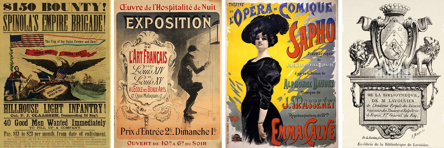
Old books and posters did this the bad way: by throwing everything a shop had into one design. Carelessly dumping a bucket of typefaces into a single piece produces a mess.
In contemporary design, we know how to optimally pair typefaces. We’re even building systems to do it automatically. Some websites claim to do AI-powered pairings, but AI still isn’t real and can’t match an actual designer’s skill.
Still, we’re getting close. One of the best examples is FontJoy. It’s been around for a while. The results are hit-or-miss, so if you use FontJoy, you may want a designer to double-check your choices. Other choices include ColorsAndFonts.
The most common pair is serif with sans-serif. One as a header and the rest as body type. Having more than 2-3 typefaces can potentially be confusing for viewers, and it’s harder to match them up.
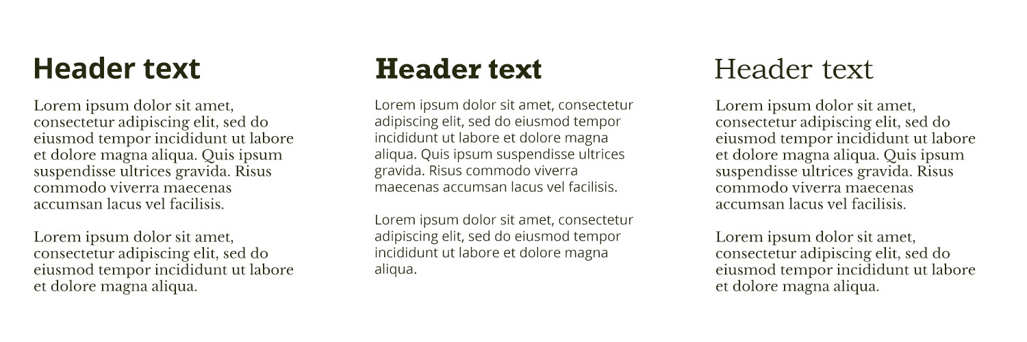
You don’t want typefaces that appear too similar, otherwise you don’t get enough visual contrast. It’d be a waste of time to try. For example, pairing Open Sans and Myriad Pro. You might be able to get around this by using different weights and styles to create additional contrast, but in that case, it’s easier to stick with one typeface.

Neither do you want typefaces that are too dissimilar, otherwise it appears jarring and ridiculous. It wouldn’t have aesthetic value. For example, pairing Papyrus and Eurostile.

Although in this case, 99% of people should delete “Papyrus” from their hard drive anyway. There are almost zero situations in which it’s appropriate.
The Goldilocks Zone in typography is to have pairings with similar elements or design features, yet are visually distinct. Factors include weight, letterform shape, x-height, and serif design (if any).
One can be extremely autistic here.
Identifying Fonts
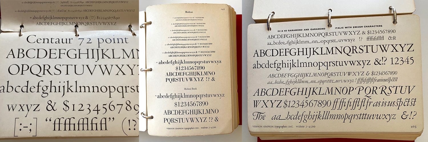
The original way to do this was with type books. A modern example is the Thames & Hudson Type Selector by Michael Worgotter.
It requires a good eye though, it’s time-consuming, and books aren’t comprehensive. New typefaces are constantly coming out. This can be a fast way to get through common fonts even if it’s less than ideal.
Sites like Identifont have tried to streamline this, but it’s not perfect. Especially since many brands now have custom typography.
Automatic identification can be done in programs like Adobe Photoshop, or web services like WhatTheFont or FontSquirrel. Also imperfect, but you can at least quickly get within the same ballpark.
Identifying web fonts is the most simple. Right-click, view source, then scroll or ctrl+F the HTML/CSS to see what they’re using. Twitter for example includes the possibility of using Roboto and Helvetica. Or look for a browser extension to do this automatically.
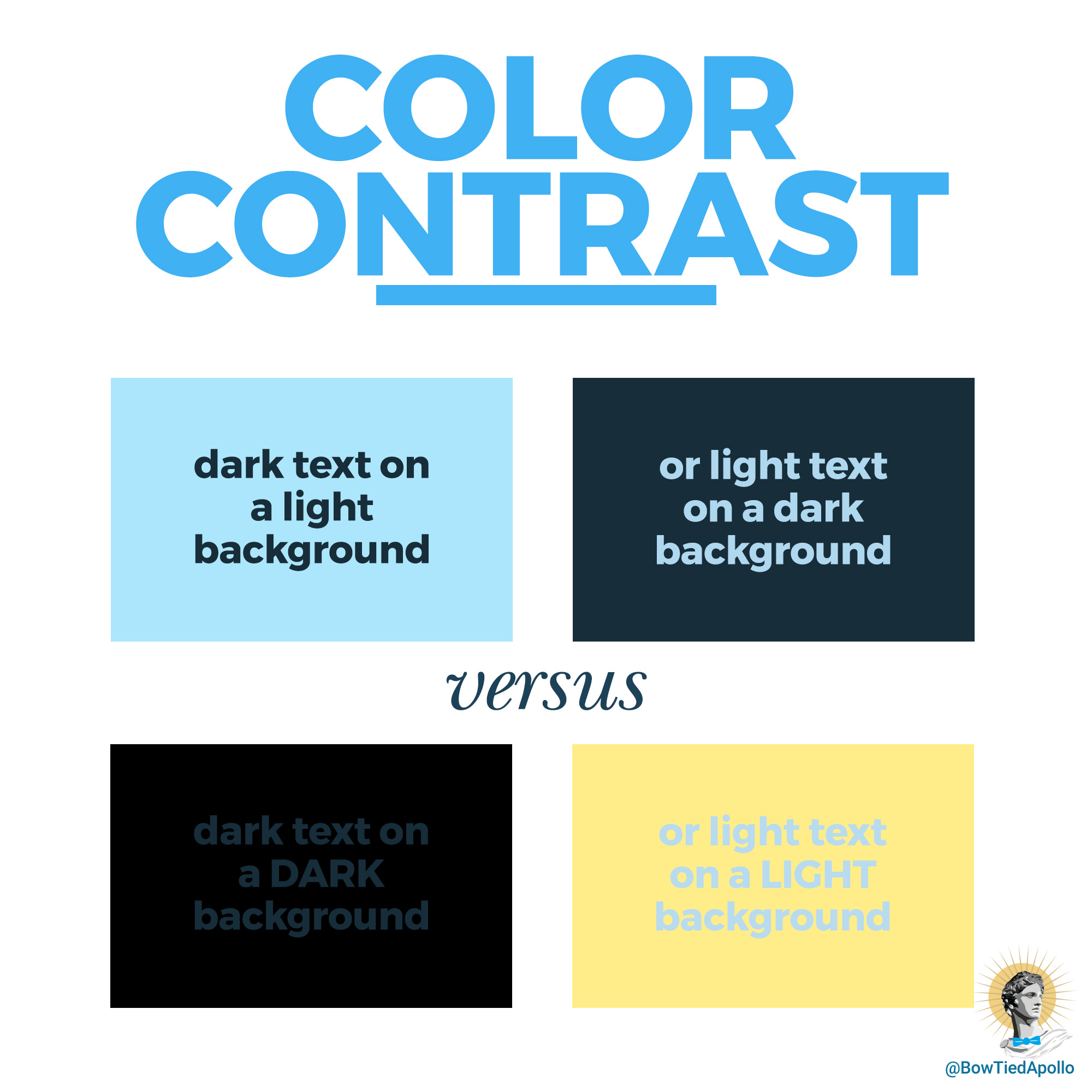
Color and Contrast
Don’t forget to keep things visible. Dark text on light backgrounds or light text on dark backgrounds. Appropriate sizes, styles, and image resolutions.
Readability and legibility are a top priority for non-decorative text. Typography is meant to be seen and understood with little to no friction.
Miscellaneous Ideas
Typography is center stage in writing, of course, but it can go beyond that. ASCII art and concrete poetry, for instance. Some designs are nothing but text.
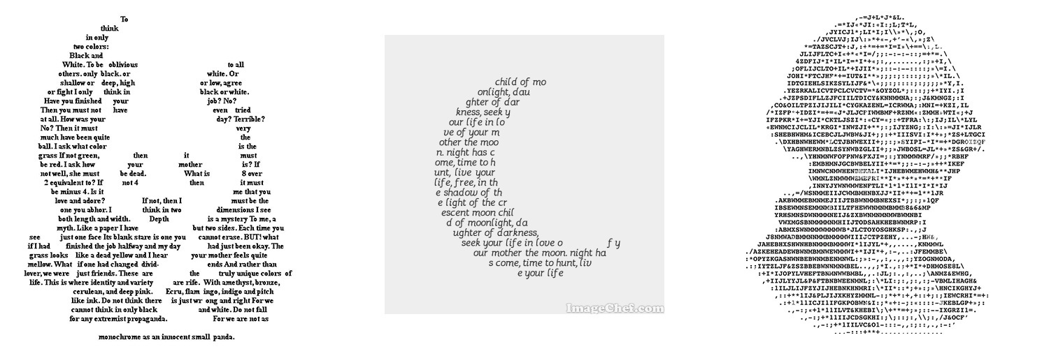
Typography is everywhere.
Conclusion
Typography is versatile and there’s a ton of freedom with what you can do. This freedom does come with responsibility though. Knowing how, when, and why to use certain typefaces elevates designs from a homemade appearance to a professional one.
A “design” isn’t just layout and imagery. Graphic design is a massive interwoven system of rules and guidelines, with creative freedom on top of that. There are objective standards for “good” design, as much as some people proclaim the opposite.
Aesthetics matter. I don’t make the rules.


This is a reader-supported publication. For further support of my work:
I sell physical artwork at ApolloGallery.org with more to come
You can hire me for graphic design work